
Volta
Check-in to charge
Electric vehicle charging company Volta is introducing paid fast charging and needs a cohesive mobile and charger check-in experience across new paid and existing free chargers.
Role – Lead Product Designer
Team – Product Manager, 3 Engineers, Product Designer and Researcher (contract)
Goals
Situation
Volta was moving from a free to tiered charging model (free and paid, depending on charge speed), which would not only be prohibitively costly to retrofit the 500+ physical chargers with payment hardware but ruin Volta’s industrial design.
Task
Redesign the mobile app to take payments, manage and monitor charging, and provide post charging services.
Action
De-risk major user experience and payment concerns via user research and onsite testing. Collaborate with mobile team product management, engineering, quality assurance, and organizational stakeholders to design, prototype, build, and launch Volta’s Check In to charge workflow.
Result
After 3 months, refined and launched Check Ins with an 80% user success rate at Volta HQ in San Francisco, ready to optimize and continue to rollout out to the nationwide charger network.
Research

Competitive Analysis
NFC/RFID is super easy (get close with mobile check-in)
Latency is very low (tech needs to address this)
Payment requirement (what about "pay for free charge"?)
Monitor and end charge (notifications, receipts)

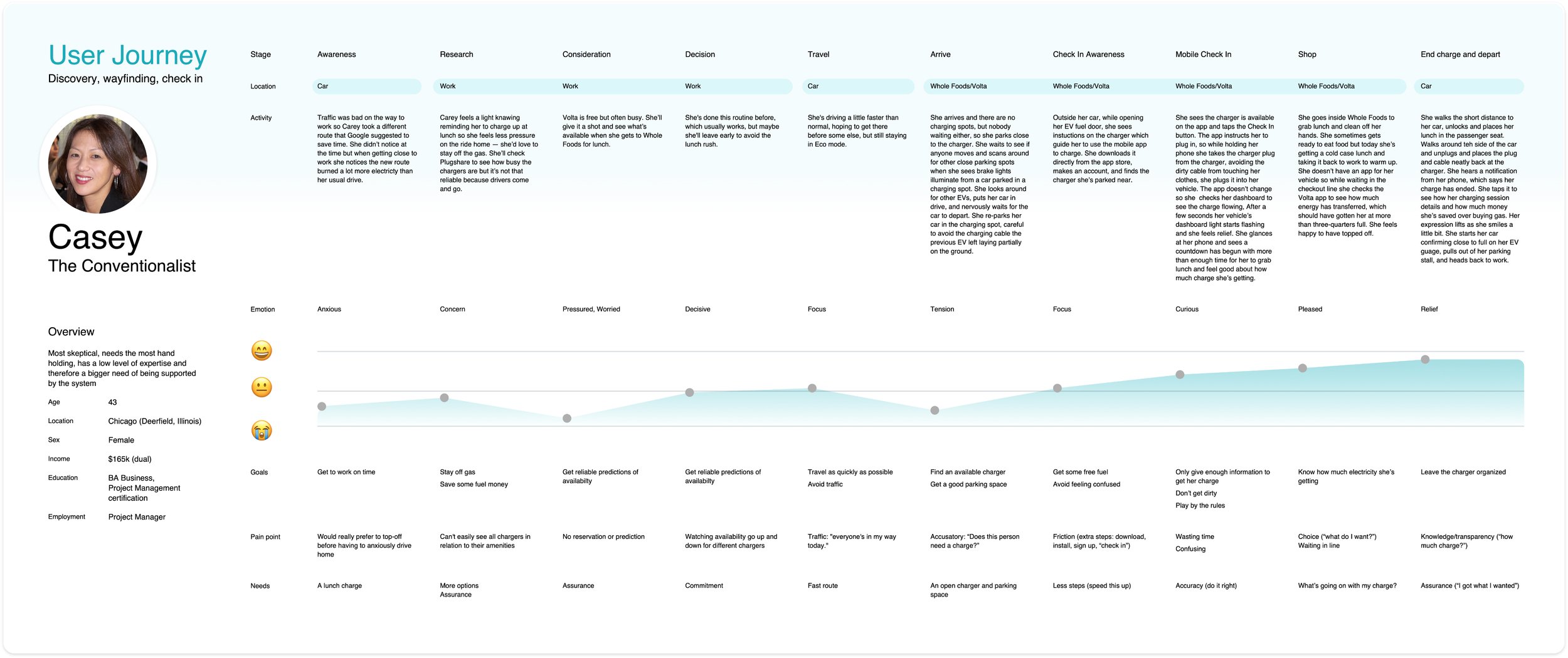
Personas
Technological
• Vehicle range - 250 miles vs 25 miles
• Fluency - has vehicle app vs understands charge load balancing
Behavioral
• Public charging frequency - daily vs weekly
• Proximity to other services - directly near vs walking distance
Economic
• Cost per charge - free vs cheap vs fast/expensive
Customer Journey
Low points 😭: Charger availability during Search and upon arrival

Storyboard
1. Want fuel, 2. Identify and navigate to charger, 3. add payment (NEW), 4. check in on mobile app (NEW), 5. Charge (monitor, control – NEW), 6. End (review, receipt – NEW)
User Testing
Phase 1: “Welcome, please check in”
Qualitative interviews + click-thru prototypes (12 participants)
Wireframes + Prototypes: Low-fi designs provided lots of context but leaned towards cognitive overload
Phase 1: Key takeaways
Competitor experiences primed customers to add payment cards in order to receive a free charge
1
Idle fees were seen as discouraging other users from blocking chargers.
Idle fee: money charged when a vehicle is plugged in but not charging.
2
Charging was often seen as a secondary activity, coupled to grocery shopping or leisure activities
3
Charger Reservations – based on Phase 1 takeaways
A new opportunity to reduce anxiety for customers while commuting to a charger.

“Driving to a charger and not knowing whether it’s going to be available when I get there always makes me nervous. Ideally I’d want to know it’s gonna be there and ready for me.”
–Sandy
Pushed to post launch because of technical difficulty
User Testing
Phase 2: Disrupting existing customer behavior
User testing (8 participants) with live mobile app, chargers, and vehicles

Charger signage
Current signage is not disrupting existing customer behavior.
“I understand the signage, I just didn’t pay attention to it.” –Mia (left)
“If I’ve been successful in the past using the same system then I there’s no reason to pay attention to anything.” –Sumera (right)
Phase 2: Key takeaways
New signage disrupting existing customer behavior?
No, only 25% (1 in 4) noticed
It was mostly ignored even when charging attempt was unsuccessful.
1
Check in workflow successful?
Dependent on historic use
Existing customer success = 100%
New customer success = 50%
New customers were somewhat successful; regardless the sequence is fragile and needs more process support.
2
Emergency charge* viable for launch?
No, only 25% success
Most users thought they were receiving full 2 hour charge instead of 30 minute.
This stakeholder requirement was removed after it was explained how unintuitive and difficult this feature was for customers.
*30 minutes charge with no app
3
Push notifications helped all users feel more comfortable while charging.
4
Check-in tutorial – based on Phase 2 takeaways
A new opportunity to hand-hold users through the charging process, especially when hardware and cellular network latency plays a big part in success.
“I'd prefer to follow instructions on my phone to indicate I'm doing things correctly.”
–Michael

Additional exploration for guiding users through the check-in sequence felt like a stronger solution but was backlogged because of scope increase.
User Testing
Phase 3: Dialing in signage and check-in
User testing (10 participants) with live mobile app, chargers, and vehicles
Signage evolution
Illustrations in version 3 (right) were more attention getting and mapped better to the mobile app experience.
Phase 3: Key takeaways
Signage disrupting existing customer behavior?
Yes: 80% acknowledged signage
Updates performed better especially with new plug hang-tag (can’t ignore that one).
1
Check in experience ready for limited launch?
Yes
Check in success rate satisfied team and stakeholders for limited public launch.
2
Is receipt timeliness important post charge?
No: 10% (1 in 10)
Customers rarely require receipts even for paid fast charging.
3
UX compromise
In order to ship, we went with a modal popup tutorial (below), which is a bit abstract and not supportive through the check in process. This would be high priority to update post launch.
4
Modal popup tutorial (swipe from right/left to navigate)
Mobile charging workflow
FINAL
Key features
Charger proximity automation
More intuitive start charge buttons
Tighter integration between charger status and mobile screens
Notifications for charge start, reminder, and charge end
🚀
Phase 3: ready for limited public launch!
80% successful check ins (goal 90%) – monitor onsite public check ins and engage customers for feedback, adding charger handle labeling